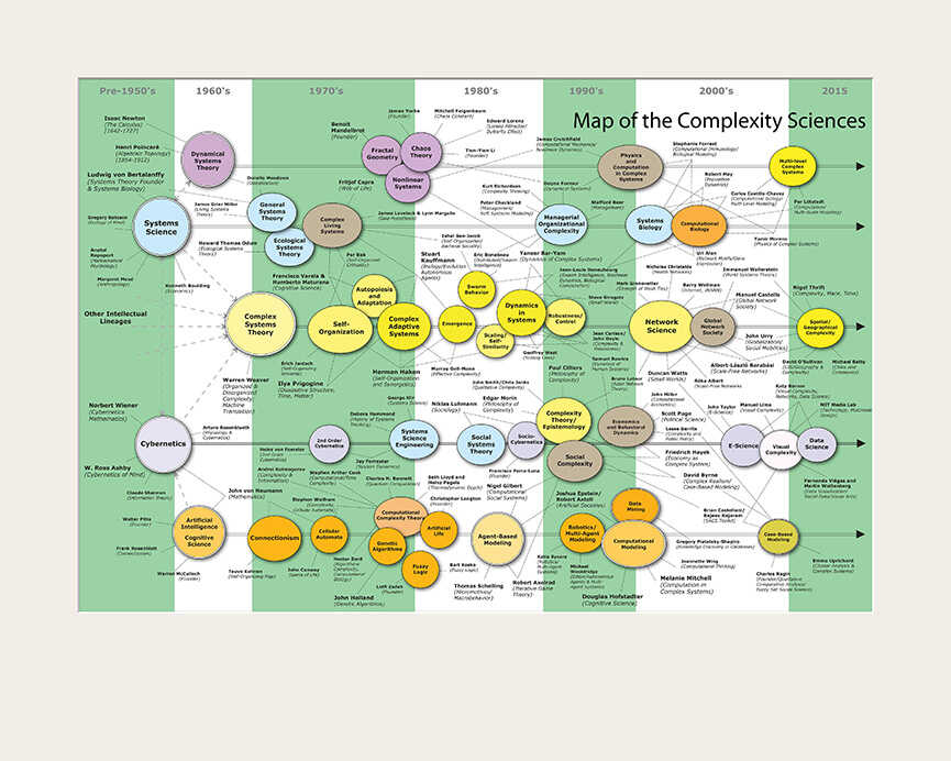
From the introduction to the project:
"Science maps serve as visual interfaces to immense amounts of data, depicting myriad objects in ways that allow us to effectively discern apparent outliers, clusters, and trends. The Places & Spaces: Mapping Science exhibit aims to introduce science mapping techniques to the general public and to experts across diverse disciplines for educational, scientific, and practical purposes. It is meant to inspire cross-disciplinary discussion on how to best track and communicate scholarly activity and scientific progress on a global scale.
For centuries, cartographic maps of earth and water have guided human exploration. They have marked the border between the known and the unknown, firing the imagination and fueling the desire for new knowledge and new experience. Over time, geographic maps became more accurate, more sophisticated, but the thirst for discovery, along with the need for maps to guide our travels, remains undiminished.
Today, our opportunities for discovery reside less in physical places than in abstract spaces. The sea of information is one such space, and it is ever growing, ever changing. Search engines can retrieve facts from this ocean of data, but they cannot answer larger questions about the seascape as a whole: How big is this ocean? How can we navigate to the useful islands of knowledge? How is knowledge interlinked on a global scale? In which areas is it worth investing time, effort, and resources?
Drawing from across cultures and across scholarly disciplines, Places & Spaces demonstrates the power of maps to address these vital questions about the contours and content of human knowledge. Created by leading figures in the natural, physical, and social sciences, scientometrics, visual arts, social and science policymaking, and the humanities, these maps allow us to better grasp the abstract contexts, relationships, and dynamism of human systems and collective intelligence. Individually and as a whole, they allow data to tell stories which both the scientist and the layperson can understand and appreciate.
The maps are generated through scientific analysis of large-scale scholarly data sets (e.g., publication, funding, and patent data) in an effort to connect and make sense of the bits and pieces of knowledge they contain. Many maps are interactive--visitors can zoom into continents to explore the subdisciplinary structure of different sciences or to access details on specific data records.
Now in its tenth year, the exhibit has traced the evolution of science maps, featuring the best examples of knowledge domain mapping, novel location-based cartographies, data visualizations, and science-inspired art works.
Phase 2 of the Places & Spaces exhibit will invite and showcase interactive visualizations, so-called Macroscope tools, as our exhibit team and international Advisory Board endeavors to spread data visualization literacy and empower people of all backgrounds to use data more effectively for a variety of purposes."